River Hill High School
|
Sage Freed
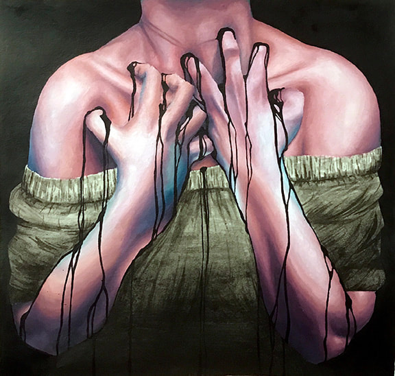
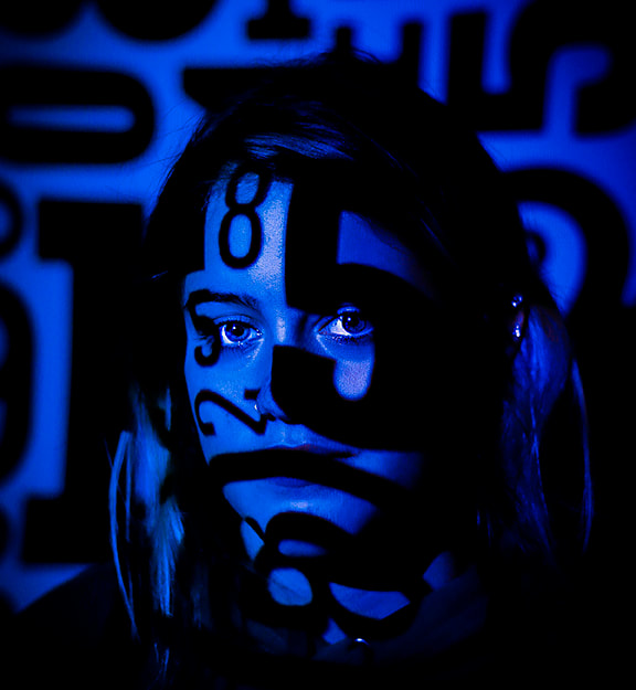
Grade: 11 Course: Art IV AP Title: Black Blood Medium: Oil on paper Instructor: Jennifer Smith Artist Statement My overarching theme for this series is mental health, specifically my own experiences with different types of mental illnesses and its effects. I decided on this topic because it's super important to me, and it's helped me with my journey to understand and support myself. The part of my art that has changed the most throughout the entire series is definitely the exaggerated colors of the skin tones. Each piece evolved has a different color scheme, and also different application from brushes. I chose to utilize the exaggerated skin tones because it adds extra meaning, and shows the emotions of the piece. Along with that, the black and white from India ink helps contrast the skin tones and add extra emotional impact. As an artist, I’ve learned that I get burnt out a lot with oil paint, specifically when blending the skin tones to be super realistic. I’ve also learned that I enjoy using India ink and dip pens a lot, even if I didn't end up using dip pens that much throughout these artworks. This series has helped me grow as a person, and has helped me think a lot about my own mental health and how I should approach it in terms of healing. |

|
Lindsay Khalluf
Grade: 11 Course: Art IV AP Title: Unwelcome Broadcast Medium: Acrylic paint on cardboard Instructor: Jennifer Smith Artist Statement My sustained investigation for this year revolves around self-deception; how our own minds deceive us. This piece in particular is about how even when no one is around, we feel as if we have a “part” to play. The constant push of societal standards has convinced us that we are always the center of attention- everyone is constantly watching our every move. I created this piece after I noticed this feeling in myself. I have caught myself changing my behavior to be more socially acceptable, or really, just more like who I was “supposed” to be, even when no one was around. Many times, this included refusing to admit things to myself, as my mind used multiple defense mechanism strategies. I found the root of this feeling to be feeling like a “character.” Society has conditioned us to believe we exist for others’ approval. More importantly, the overconsumption of media inevitably causes many of us to view ourselves/our lives from a 3rd person perspective. To represent this, I painted a person with their head and the inside of a TV switched to illustrate the feeling of feeling like a character. I added curtains and Venus flytraps with eyes in them to add the feeling of constantly being watched. I chose to have a stark contrast between reality and fiction, as well as media and nature, to emphasize how this feeling is very subtle, and easily intertwined with reality. It is difficult to notice you are even doing it; it is a subconscious process. This piece was pretty much my first real painting. I did it on cardboard, and I ended up finding a newfound love for a material, in addition to a proper representation of the abstract feeling I was experiencing. |
|
April Kiende
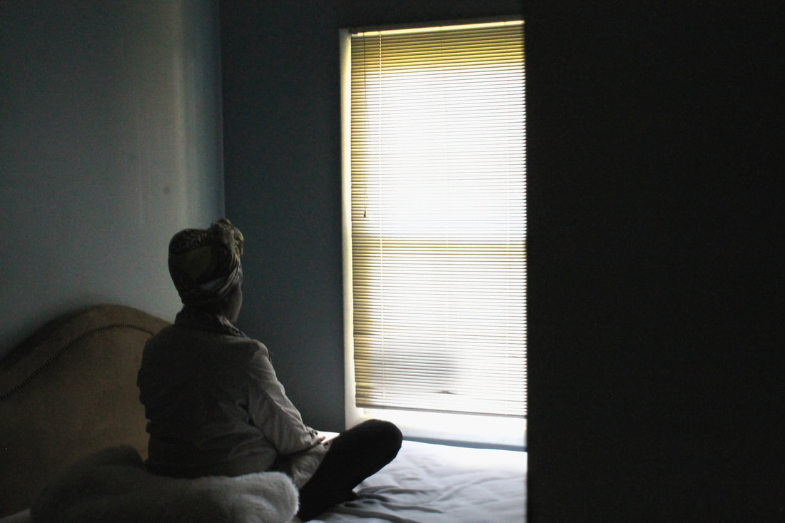
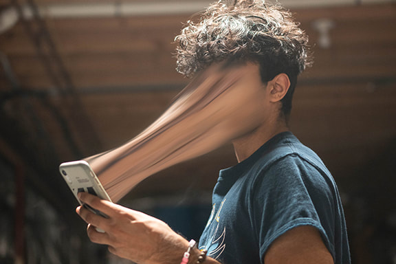
Grade: 11 Course: Photography II AP Title: Light in the Darkness Medium: Canon EOS Rebel T3 Digital SLR Camera Instructor: Caroline Appel Artist Statement This piece was part of a bigger project where I was investigating the impact music had on an individual’s state of mind. In this photo, specifically, I was aiming towards portraying the contrasting feelings of loneliness and lightheartedness that one can feel while listening to certain genres of music. For me personally, the song “Jealous” by the indie rock group, Eyedress brings upon such feelings in me. The song has a dark, desolate undertone, but yet the fast pace beat of the bass and the drums provides a balm to my soul and turns a bad mood into a positive one. My experimentation with ISO and shutter speed allowed me to achieve the contrast in the brightness of the window and the dark environment of the photo portraying the clashing of emotions in one mind space. Creating this photograph was quite easy for me as I knew exactly what message I wanted to get across since I have experienced such emotional changes. During my process, however, I began to realize how great of an influence music had on my life and others my age, and was excited to present that aspect of my teenage life in photo class. Overall, I feel like I did a great job accurately depicting the various feelings music can bring upon people, including myself, influencing their state of mind. |

|
Michelle Lei
Grade: 11 Course: Photography II AP Title: The Ritual Medium: Sony α 6500 DSLR Instructor: Caroline Appel Artist Statement When taking this photo, the question of how beauty and vanity affect one’s sense of self was ever present in the back of my mind. My goal in this photo was to display how somebody’s obsession with being skinny might influence their everyday life. I’ve struggled with anorexia, largely because I thought that losing weight would make me prettier and more likable. In my mind, I was more worthy of love and respect when I was skinny. Every single night, I would weigh myself, panicking at every half pound fluctuation. My photograph is intended to showcase the dehumanizing process ritually stepping on a scale can be, whereupon the person is no longer a person, but an object to pick apart. I was inspired by the work of David Arribas, who photographed a young girl, Nerea, struggling with anorexia. He photographed the harsh truth of the eating disorder without glamorizing it. I took the photo by putting my camera in a shelf at ground level and focusing it on the scale I used to weigh on. I set a shallow depth of field and slow shutter speed, and set a timer that would allow me to step on the scale as the photo was being taken. Throughout this experience, I’ve learned how important it is to take photos grounded in truth because other people can and will relate. It was a relief to be able to use the worst period of my life as inspiration for an honest piece of work that shows the mental toll a daily ritual of weighing can take on somebody whose life revolves around being skinnier and more beautiful. |
|
Allison Young
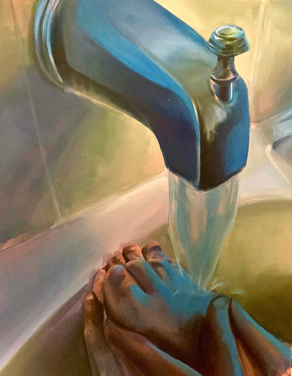
Grade: 11 Course: Art IV AP Title: Humility in Color Medium: Acrylic on Canvas Instructor: Jennifer Smith Artist Statement My work is an exploration of my relationship with religion. Struggling to feel confident in my faith, I wanted to use art to break down what I appreciated and questioned about Catholicism. I was inspired by the artist Elly Smallwood and how she used art to break down her own questions about Christianity and the Bible. My earlier pieces focused on the aspects of the Catholic Church that were rooted in many of my doubts: a feeling of indoctrination and the sex scandal. I then shifted my focus to what I valued about my religion. Through my idea generation, I realized much of what my faith taught me has helped in times of great loss, insecurity and selfishness. In this specific piece, the biblical story of Jesus washing the feet of his disciples, teaches the power of forgiveness and humility. The colors are unsettling to represent my constant struggle to learn to forgive myself, especially for the times when my selfishness hurt many close to me. The water and blue light represent God helping me to let go and become a better person. I chose to work with acrylic paint on watercolor paper and canvas because I wanted to improve my traditional painting technique. I specifically focused on exploring reflection in context of my theme. Through mirrors, colored lighting and translucency I learned how to better manipulate acrylic paint. My series has taught me the differentiation of spirituality vs. religion and solidified that I do want an authentic relationship with God, where I can practice values found in the Bible-but not the misleading, literal interpretations of its words. When I believe in something greater than myself, I am humbled and motivated to step outside of my world. Logically, faith seems vital to hold myself accountable in being a better person. |
|
Valerie Yu
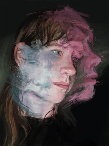
Grade: 10 Course: Art 3 AP Title: Coming of Age Medium: Digital Instructor: Jennifer Smith Artist Statement In this artwork, a portrait of my friend Claire, I sought to describe the struggles associated with adolescence and show the emotional whiplash—sometimes hidden beneath the surface—of this period of growth. I wanted to create a sense of there being several moments and realities in time, yet captured all in one. I used the digital art program Procreate to achieve this “layered” look by adjusting the transparency of different illustrations. Additionally, the painterly look of this piece was inspired by the works of Hélène Delmaire. I was intrigued by her style of defacing her portraits with energetic streaks of paint, and I tried to introduce some of these dynamic strokes into this artwork. As an artist, I am interested in exploring layers of thoughts and emotions, especially confusion. I appreciate art as a creative outlet, something to be proud of, and something to tell stories with. I’ve been making art for as long as I can remember, and I hope to one day pursue it as a career. |
|
|
Peace Adegbesan
Grade: 12 Course: Art 3 AP Title: After Hours Medium: Digital Art Instructor: Jennifer Smith Artist Statement My piece is about staying after work for very long periods of time from the point of view of someone sitting at their desk. There are lots of coffee cups and flickering lights to show how tiring working late is. I chose to make this piece because the overall concept of my body of work this year features the failures of capitalism. My parents work a lot so I’m home alone most of the time. I wanted to show how people need to work longer to make ends meet due to the fact that many companies that exploit their workers and make them crunch their work. I put a picture frame on the desk to represent how difficult it is to spend time with family and friends. My process usually begins as a rough sketch in my sketchbook. For this piece, I then made another sketch in Firealpaca and saved it as a PNG. Next, I opened it up in Krita to use as a guide for painting. As I worked. I would check to make sure the values of the colors worked well together. Once I finished painting, I saved two copies of the painting, one with light and one with no light. I edited them in WeVideo and saved it as a GIF. |
|
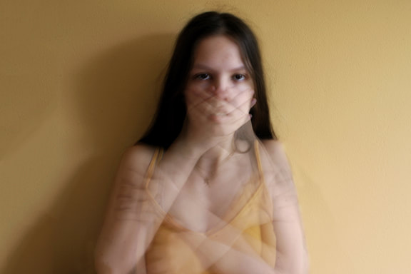
Ashlynn Braisted
Grade: 12th Course: Photo Studio AP Title: Concealment Medium: Digital Print Instructor: Caro Appel Artist Statement This photograph comes from a collection of portraits that explore the perspective of growing up as a teenage girl. My goal for this photograph specifically was to comment on the judgments and expectations placed on young girls relating to their bodies and showing skin. The various hand placements created through long exposure intend to symbolize the irrational societal standards placed on these girls, as it is impossible to constantly cover up their natural body no matter how hard they may try. The two hands covering the mouth represent the inability of girls to speak against these standards, as they are constantly shut down by adults and institutionalized practices such as dress codes, which actively sexualize and shame young girls for their natural features and demand that they cover up. |
|
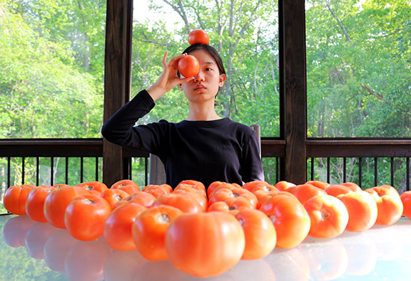
Ruby Chen
Grade: 12 Course: Photo Studio Title: Plateful Medium: Digital print Instructor: Caro Appel Artist Statement Although we all live in the same world, we are each guided by our own perception of reality. What we perceive differs on multiple levels; at the most basic level, the colors that we perceive depend on the rods and cones in our eyes. As a result, when given the same color swatch, two people likely won’t perceive the same color. However, when this difference is coupled with our interpretation of what we see, our realities truly begin to diverge. One’s identity, background, and experiences all shape our perceived realities. With this in mind, I sought to answer through photography the question of “how do these perceived realities differ?” At the beginning of the COVID pandemic, I—like many others—felt overcome with uncertainty. Just like the seemingly endless rows of tomatoes in the photograph, my sources of stress appeared infinite. When looking to the future, my hopes were clouded with anxiety. I sought to capture this perception in a photograph, using the sheer number of tomatoes to convey a sense of being overwhelmed. Even so, tomatoes are tomatoes, and all have been eaten at this point. Similarly, my worries gradually disappeared during quarantine as I learned to cope with our new circumstances. In the end, my perceived reality completely changed as I grew over time. Photography has been my lifelong companion, from which I have learned much more about myself and the world around me than I could have ever imagined. Processing my questions through the lens has undoubtedly made me a more inquisitive, thoughtful person. As I approach my future with a camera in hand, I hope to further explore our perceived realities and understand our world just a little better. |
|
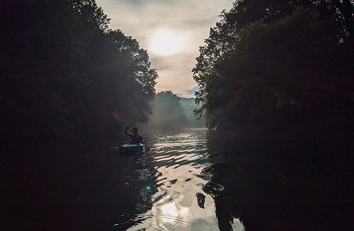
Alexandre Docouto
Grade: 12 Course: Photo 3 AP Title: From the Mist Medium: Digital Print Instructor: Jacob Cecil Artist Statement A life’s journey has a set beginning and end, both of which are unknown. To explore this path within a few months would neglect the seemingly open-endedness of our time. I found it best, under uncontrollable constraints, to reflect on another journey of mine that shared the same freedom and uncertainty. The restless nature of my life gracefully aligned with a lack of direction and plan as all five of my family members packed up, hopped into a van and looked west. Leaving my phone behind, the camera became my only distraction. Through breakdowns, late nights, spontaneous pit stops, and ghost towns, these images captured freeze-frame moments as my family and I traversed the United States. None of these pictures were planned or staged. . . my family did not plan or stage. The fluid nature of this body casts light onto what I anticipate my future days to be. We will never know what becomes of us by tomorrow, but tomorrow is all we need. |
|
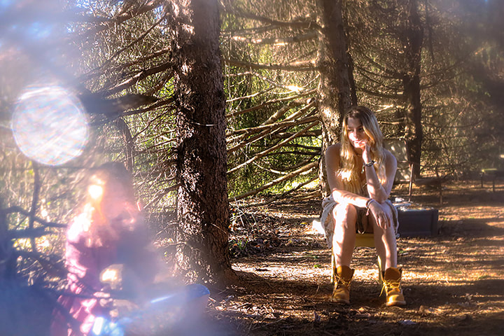
Savannah Moriarty
Grade: 12 Course: Photo 3 AP Title: Apparition Medium: Digital Print Instructor: Jacob Cecil Artist Statement For my photographs I wanted to explore the idea of how the past is able to affect the present. Using themes of memory, nostalgia, and growth, I aimed to bring attention to the various effects childhood experiences can have on someone’s persona. My work was inspired by Suvi Sievila’s Melancholy Circus. I was drawn in by her dramatic use of lighting and the way every last detail brought emphasis to the image. Each prop being used created this elaborate story to go along with the character at hand. I was driven to incorporate more thought into each of my images by taking into consideration the smaller aspects of the image. This idea came to me while I was talking to a friend about specific memories that impacted her life. She brought up an example of how greatly she was motivated to work hard in everything she does just because her fourth-grade teacher once told her he believed in her. This got me thinking about how much people will really take into consideration the smallest things as a driving force to guide their whole lives. |
|
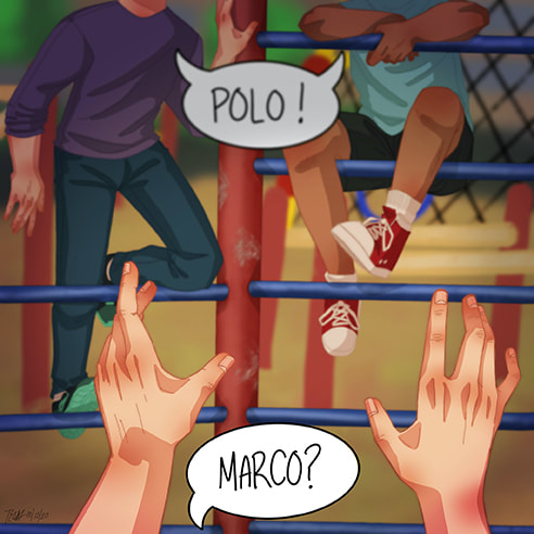
Teo Nefliu
Grade: 12 Course: Art 4 AP Title: The Marco-Polo Cage Medium: Digital Instructor: Jennifer Smith Artist Statement My art series is about my childhood memories. In this piece, I illustrated a game my friends and I would play during recess in elementary school. My school's playground had this weird, metal jungle-gym-type thing that looked like a corral which we lovingly named "The Cage". We would climb up on the bars (it was all 3 bars tall except for one side which had 7) and we would play Marco-Polo. The "seeker" would be inside the Cage with their eyes closed, wandering around the enclosed area trying to tag the other players who would climb the bars to get away. If you got tagged, or if you touched the ground, you were out and it would be your turn to be the seeker. As I did in previous pieces, I left out any faces and blurred the image to give it that hazy memory feel. The image is in the point-of-view of the seeker (obviously the eyes would be closed but that wouldn't make a very interesting picture) showing the seekers hands reaching out to tag the other players. The background, although blurred, is my elementary school's playground but I didn't make it very detailed since it's not the focus and because, since this is a memory, I don't really remember much of the details, only the vague shapes. |
|
Anya Nguyen
Grade: 12 Course: Photo 3 AP Title: Still Medium: Digital Print Instructor: Jacob Cecil Artist Statement Throughout the year I changed the direction of my work 3 or 4 times, because I wanted my guiding question to mean something to me. I started with the prompt “How do the people of a town make it unique?” and I did really like that prompt and I shot a lot of good pictures for it, but it didn’t quite resonate with me. I’ve never really felt connected with where I live so I found it hard to connect with places even more distant than that. I then switched my prompt slightly to make it a little more specific, “How does a place feel like home?” but, as I said earlier, I’ve never felt very connected to my hometown, so I wasn’t able to put my whole mind into shooting for this prompt. After a lot of trial and error, I finally found something in my life that was important enough to me to shoot good pictures that had meaning behind them, “How does a person become home?” Over the course of the year, I have gotten to know someone very special, and I realized that they had, in a sense, become my home. I finally found that sense of belonging that I had never gotten from my town. In each photograph I tried to capture a specific memory of my person, my home. I know that these memories are not universally shared, but instead only shared between two people, but this makes my series a little more special. The start of our relationship was confusing, to say the least. Neither of us quite knew what the other wanted, hence the image of the closed door. However, despite the door being seemingly closed, the lights were still on, we both knew what we had individually wanted and hoped enough that the other felt the same way that we kept trying, and eventually found each other. I finally found my home. |

|
Kianna Pan
Grade: 12 Course: New Forms in Art - G/T Title: Unwinding Medium: Digital Instructor: Jennifer Smith Artist Statement “Unwinding” is an investigation of storytelling and illustration. My work is part of a short series focused on visual development with background and character design, depicting identity through space and objects. The drawing, created digitally using the program Procreate, was inspired by the myth of the red thread of fate. As the thread of fate connects people through any time or circumstance, I created a character based on this ability. In other pieces of my series, I experimented with how her physical movements would mix with the red string. However, in this illustration, I wanted to concentrate on how the string would interact with an environment. Designing what her room would contain, I took inspiration from my friends' hobbies and interests. To make the string feel like a key part of the ambiance, I focused on color, lighting, and composition to create a peaceful atmosphere. Currently, I am continuing my investigation with visual development. As I’ve always been fascinated with using art as a medium for storytelling, I’m drawn to creating more character-driven artwork in the future. |
|
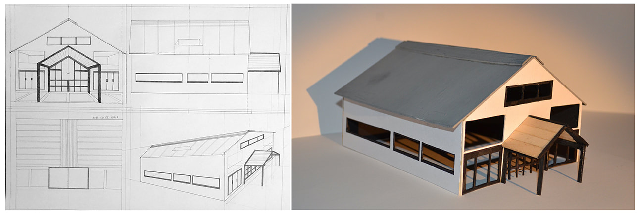
Kristen Park
Grade: 12 Course: New Forms Title: Modern Farmhouse Imaginations Medium: Mat Board, India Ink, Popsicle Sticks, Acrylic Paint Instructor: Jennifer Smith Artist Statement The three-dimensional modeling and perspective drawing that I have compiled, started as an inquiry. Enrolled in the New Forms Art class at school, I had the liberty to explore various architectural styles. Quickly, the concept of traditionalism and modernism stood out to me, which I have since delved into, creating my series. For my first piece, I decided I would start with an architecture staple, farmhouses. Approaching with caution, I picked up my pencil and began to design the facade. I was sure to focus on the factors that determined tradition and modern aspects, including color, shape, and material. I started with an idea of pentagonal prisms, many windows, and a portico, some structural elements that I later defined. Modernization on the color wheel to be seemed to be defined monochromatically, black and white. On the other hand, tradition seemed to be more of a homey, warm tone. With a combination of colors and materials, I found that a gray roof, white exterior, black ascents, and wooden portico would work best. As a result of all my mental considerations, I made the oxymoron of the modern farmhouse to be. Without the support of Ms. Smith, Ms. Appel, and Mr. Cecil, my amazing art and photo teachers, I would not be the artist I am today. They have helped me through this journey of medium exploration and craftsmanship building without failing to instill a welcoming art community. As I prepare to further my education in efforts to become an architect, I will forever be grateful to all my mentors who have made this opportunity possible. Special thanks to Mr. West, my middle school art teacher, and Mr. Ryan, my PLTW teacher. |
|
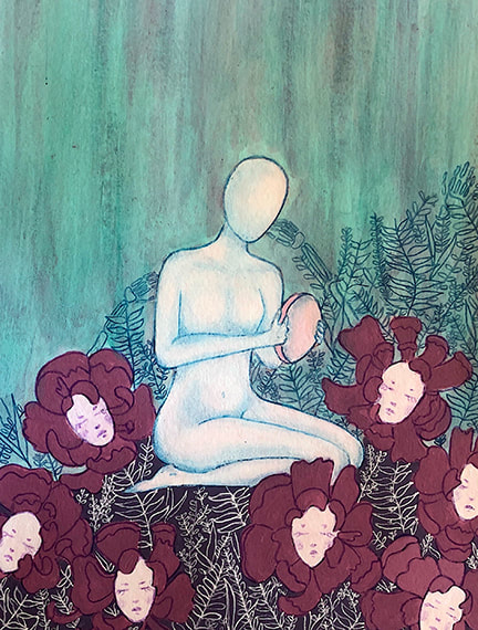
Nimisha Seshadri
Grade: 12 Course: New Forms GT Title: Bed of Masks Medium: Acrylic Paint and Colored Pencil Instructor: Jennifer Smith Artist Statement For the majority of my high school art career, I always found myself gravitating towards more realistic styles that often required references. With my pieces this year I wanted to challenge myself creatively. I began sketches for this piece with no theme in mind, and only after I finished, I found meaning in it. I saw my struggle in understanding who I was, the skeleton hands; who I am, the mask that the figure is holding; and who I wish to be, the blooming flowers. Another way I look at this piece is the process of overcoming loss and understanding who you are once someone you love is gone. I enjoyed not having to stick to a specific theme and leaving my piece open to interpretation even as I was creating it. As for materials, I found that I could add very intricate details with colored pencil and gel pen on top of the dried acrylic paint and ended up loving it. The white gel pen layered on the dark purple background added a really interesting look to the piece. Since the figure and flowers left a lot of empty space on the page, I decided to layer as many vines as possible without overcrowding. With color pencils, I added shading to the figure which gave it a bit more depth. The faces on the flowers came to me in a dream and reminded me of the talking flowers from Alice in Wonderland. Making art has provided me with the opportunity to express myself beyond words and push myself creatively. My background as an artist has allowed me to approach certain aspects of life, even math problems, from a different perspective. |
|
Max Sheppard
Grade: 12 Course: Photo 3 AP Title: Blue Medium: Digital Print Instructor: Jacob Cecil Artist Statement This year I examined feelings of anxiety and stress that teenagers go through, most commonly regarding the stress of time. When brainstorming what I wanted to do for my photographs I thought about many of the things that occupy my mind and consulted my peers to find out what occupies their mind the most. Due to this I realized that teenagers have one main thing in common, which is that we spend excessive amounts of time stressing and being anxious about many things. For my first images I wanted to use long exposure to show movement in my photos in order to represent how fast time can move, while you may feel stagnant. Following my first shoot I decided to make all my images connect by giving them a hue of blue when post processing. The colors that are present in my images are representative of the gloominess that one may feel in their mind. Throughout my work I expanded on the main anxieties that teenagers have, creating images the evoke fear, sadness, or abandonment. I drew inspiration from a variety of sources. This included other photographers like Alex Stoddard and Petra Collins due to their unique style of photography. However, the most important people I drew inspiration from were my classmates. Seeing their work every class gave me new ideas for my images and inspired me to challenge myself when it comes to the images that I create. If there’s anything anyone can take from viewing my work, it is that the human mind can be a dark place and it is necessary to confront that darkness in order to overcome it. Most importantly, I would love for viewers of my photographs to relate to some of the things that I am creating and realize that they are not alone in any personal mental health struggles that they face. |

|
Emily Stanley
Grade: 12 Course: Art 4 Studio AP Title: Anti-Life Society: How Society Fails Us Medium: Mixed Media Instructor: Jennifer Smith Artist Statement For my piece, I wanted to focus on what I consider to be the most detrimental aspect of our society today, it’s lack of value for human life. I chose to represent my artwork in the form of a book, this allows for hands on interaction and a connected theme over many pieces. My book consists of 8 topics, which include two art works and two textured works in each topic. I strongly believe in the intrinsic value of human life from the first heartbeat to the very last. Every human being has their own specific blueprint, and the chance for you to be the exact person you are, is estimated to be around 1 in 400 trillion. This fact alone can help put into perspective just how valuable each human life should be. Unfortunately, starting as early as a child in the womb, our lives are not seen as valuable. We are seen as disposable and replaceable, which is a grave injustice, and allows for the continued devaluing of humans throughout their lives. My series addresses topics such as Abortion, Rape Culture, Feminism, Immigration, Children in cages, LGBTQ+ Rights, Religion, and Mental Health. All of these share the commonality of root cause being dehumanization. We dehumanize a woman who has been raped, and look at what she wore or how she acted as an excuse for what has happened. We look at a child in the womb as disposable for our own convenience. Women are devalued and overly sexualized, rather than valued for their incredible minds. Nearly 1 in 5 US adults live with Mental illness, yet there is still a stigma of instability and judgement associated with it. Society fails us, and we participate and allow it. My hope is that through advocacy in our country, we can change our views and do better. |
|
Sanket Vaja
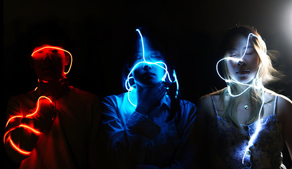
Grade: 12 Course: Photo 2 AP Title: Soul-I.D. Medium: Digital Print Instructor: Caro Appel Artist Statement My goal with this project was to highlight a true representation of what technology use means for you. Many times, we take certain applications for granted without considering the potential consequences for interacting with a supposedly “free” service. Many times, the algorithms utilized by these companies are able to map your preferences and interests to an unimaginable level of accuracy through millions of data points. They effectively create a perfect ID of you for advertisers and content distributors to utilize. For the first time, we are no longer identified by physical traits such as our face or fingerprint, but rather our specific interests and passions - almost like a mapping of our soul. Understanding my classmates’ lack of awareness when it came to technological issues of this matter inspired me to pursue a project which could tackle the issue head-on. For many, considering the implications of modern technology is not as important as it should be, and this work is meant to highlight that. Our relationship with technology is an incredibly important conversation as we inch forward into a fully digitized future. This work was created using a variety of post processing and editing techniques and the main effect was inspired by a multitude of technology awareness campaigns run on social media. I hope that viewers of my work will take further consideration of their relationship with technology and understand their role in the ecosystem of social media and “free” products. |
|
Vannak Tann
Grade: 12 Course: Photo 3 AP Title: RedWhiteBlue Medium: Digital Print Instructor: Jacob Cecil Artist Statement My goal for this project was to capture the shared experiences of Asian-American people within the United States through thematic imagery. Throughout my project I ask you to please take note of colors, location, and lighting; techniques that I had chosen to illustrate aspects of Asian American life. In order to do so, I imbued my images with motifs of being trapped, confined, and additionally my interpretation of the American Dream. These can be found through strings of red, white, and blue wrapped around a subject’s neck, being locked in a room, or freedom of suburban life through documentation of a neighborhood. My inspiration for this assignment mainly came from the backlash that rippled throughout society in the heat of the Covid-19 pandemic. Fortunately for me, growing up in an area with a large Asian population meant that I had never overtly experienced racism, but for the first time in my life, I had been fearful to own up to my culture. Stories of hate crimes towards Asian-Americans throughout the country were shared on a daily basis as innocent people were increasingly being attacked with malicious words and violent actions. Alongside this, I felt that even within the media, Asians tend to be looked down upon, and thus I wanted to document my emotions and perspective on being in such a position. In short, this series was more my take on the current situation within our country. Each person has their own perspective and views, and therefore, these images act as a catalyst for thought. Instead of utilizing photojournalism techniques and direct depictions, these creative interpretations are accounts of my current outlook on life. |
