Oakland Mills High School
|
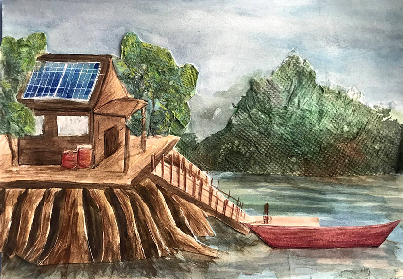
Mylie James
Grade: 11 Course: Art Studio III AP Title: Mangrove Home Medium: watercolor, colored pencil, tissue, paper, tempera, and pen Instructor: Lauren Steele-Worsham Artist Statement Throughout this school year, my art has focused on the exploration of how human made structures can intersect with the natural world in order to provide people with healthy living and working spaces that do not harm, but rather help and blend in with the environment. “Mangrove Home” is a concept of a house designed to mimic the features of a mangrove tree. There are 80 species of mangrove trees and shrubs found along coastlines and brackish waters throughout the world. Mangrove tree roots absorb fresh water and store the excess salt in their bark and leaves, allowing the plants to survive in brackish and salty environments that most plants cannot tolerate. This home would do the same, with the stilts performing the filtering process of a mangrove tree and collecting the freshwater for use in the house, along with rainwater collected from a rainy environment. The above water arching roots shown in the piece would look and feel just like the real roots and provide additional habitats for the plants and wildlife in the constantly shifting and flooding tidal environment. The elevation would prevent the house from being flooded or infested with vermin. Solar panels provide the home with energy, and there’s a boat for travel and work. The use of colored pencils in the wood and house texture and the napkins used for the foliage help to bring out the textures and feeling of trees and wood. This is not completely scientifically accurate, but more of a creative exercise to make a house that conforms to its surroundings while still being modern and appealing. I have enjoyed combining my passion for environmental science and futurism, as well as a newfound interest in architecture and mixed media art. |
|
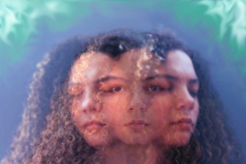
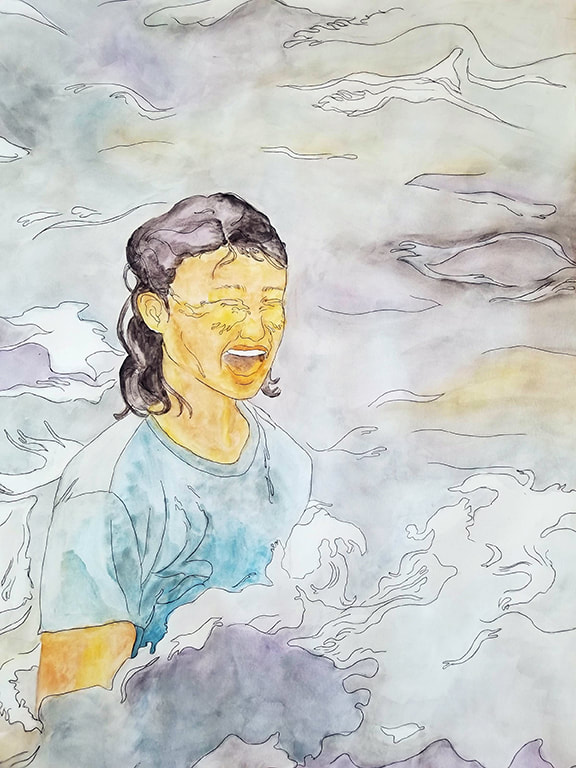
Rory Lawson
Grade: 11 Course: Photo II AP Title: Left Brain vs. Right Medium: Digital Photography Instructor: Kiersten Bram Artist Statement With a focus on mental health within these past few years, and having more time with our own thoughts during quarantine, I wanted to create a visual exploration of my own mind. I find that we often have many different decisions to make every day leading to decision overload. In order to make these decisions, we usually go through an internal conversation occurring in both large and small-scale situations and also can apply to ideologies. This thinking process that occurs can be referred to as critical thinking. While still being a personal struggle, this is a struggle many people can also relate to. When discussing the brain, we are told we have a left side of the brain and a right side, each having its own priorities. I wanted to represent this by overlaying and blending two different photos each with the subject’s head pulling into two different directions. In the top left and right corner can be seen whirls of color which I added to create a visual representation of neurons and bring the image more to life. In the center, the subject’s head remains facing toward the viewer with a blank expression to show what others see going on the outside. In reality, you wouldn’t see the inner workings of a person’s mind. One photographer I took my inspiration from was Marta Syrko. In her photos, she plays around a lot with the dramatic use of color and lighting. This in the end often makes her photos pop, leaving them to look very otherworldly and unique. As someone who often sticks to capturing what is right in front of me in a clear and crisp way I usually don’t explore more playful techniques. With this photo, I was able to be more creative and out-of-the-box. |
|
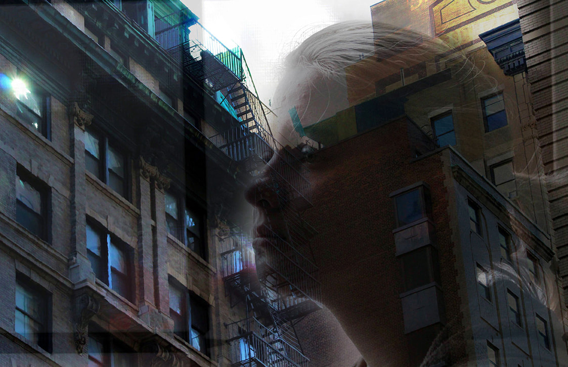
Erin Oliver
Grade: 11 Course: Photo II AP Title: Stillness of Remembering Medium: Digital Photography Instructor: Kiersten Bram Artist Statement This photo demonstrates the sadness and longing for the outside world that has accompanied the COVID-19 pandemic. This is a layered image with multiple photos used to create one final work of art. The first layer is a photo of New York City and it represents my future aspirations to attend college there. The figure subject is my sister, who has had a particularly hard time with being trapped at home. The third was a combination and adjustment layer with varying transparency. My goal was to show that numbness and solitude has become the new normal this year. Discovering and experimenting with photo editing tools has been a read adventure. Using multiple images and layering and blending them takes patience and lots of experimentation to get it to look just how I imagined. This image aligns with my sustained investigation for my AP Portfolio because I am focusing on capturing and emphasizing human emotions. I hope the viewer is able to imagine the feeling of longing and emptiness, which during this past year we have all felt in one form or another. I am looking forward to the time when I can visit New York again and finalize my plans for my future. Photography is definitely a path I will continue to explore. |

|
Kenneth Quiles-Rios
Grade: 11 Course: Photo II Title: My Sanity Medium: Digital Photography Instructor: Kiersten Bram Artist Statement My photo was taken during the pandemic and represents a difficult time for me. Being isolated and alone, I chose to document the interactions between me and my dog, Winter. I realized she needed me and having her was helpful to me because it made me go out and interact with the world- even when I didn’t feel like it. There was a need that was developing for each other. Winter needed me to care for her and I needed to have a purpose. My purpose during this difficult period was to care for the dog I love so much. My artwork and photography became more purposeful and planned as I explored new techniques using digital photography. For this particular photo, I explored lighting and different settings on the camera. My goal was to capture the leash as a symbol for our connection for each other - we needed each other and the leash was the best symbol I could think of. Playing around with many compositions and lighting, I ended up with a view that was natural and symbolic. Although the composition is simple, it is a demonstration of the many hours I have put into setting up photo shoots and learning about photography. I am happy with it and thankful I had my dog to help me through one of the most difficult periods of my life. |
|
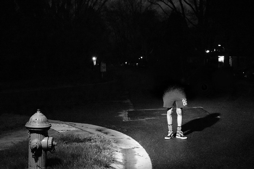
Lilly Smull
Grade: 11 Course: Photo II AP Title: Chicken Legs Medium: Digital Photography Instructor: Kiersten Bram Artist Statement Insecurities create emotion and struggle in many lives, often dictating someone's actions. They can make a person's mood low, where hiding feels natural and safe. I interviewed my model, who told me that he has always been insecure about how small his legs are. I wanted to emphasize his legs and allow the rest of his body to disappear because sometimes that is what that part of yourself feels like because you cannot stop paying extra attention to it. It was important to leave his cast shadow from the light to remind the viewer that this is his feeling, insecurity, and view. I used dramatic lighting, depth and made the photo black and white to give the photo a dark mood. I was inspired by the gloominess of a lone lamp post at night and how the light would emphasize a sliver of space while leaving darkness surrounding it. It would express the meaning of the photo and create a spotlight. My work took a lot of planning and benefitted from thorough attempts. It took many tries to get the settings and angle right when trying to capture my subject. When I started, all of my photos were blurry and too dark or too bright. Once I started editing my picture, I layered pictures and used the brush tool to erase parts of the photo and create the fade. I enjoyed putting in the effort to create precise details to allow my art to tell a story. It was time-consuming and at times frustrating, but it paid off when I was able to show my model the finished product because he smiled at his legs. |
|
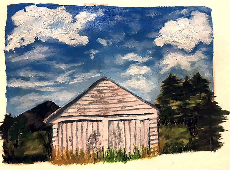
Daniela Chiluvane-Novak
Grade: 12 Course: Art Studio 4 AP Title: Two Versions of One Person Medium: Acrylic and Watercolor Instructor: Lauren Steele-Worsham Artist Statement This artwork was originally a diptych portraying the different states of a person’s mind through two very contrasting compositions. The first piece in the set is a barren desert painting that symbolizes one person’s dry and dissociated personality; whereas, the second artwork, “Two Versions of One Person,” is extremely lush with a view of vibrant greens, blues, and implied texture. Although this piece appears to be full of life, it also pictures a lonely and abandoned white shed as the focal point. This emphasis on the shed conveys the dark and dry sides that lie within all of us, even one with the brightest personality. I believe people have a version of themselves that they project and a side that they strive to hide, and I wanted to expose the stealthy truth. My inspiration grew from artist Mark Maggori. He creates large scale old western oil paintings that draw you in and take your breath away. The way in which he captures the time in place is incredibly captivating. The shed structure painting was inspired from a previous artwork of my grandparents’ house, which is where I discovered my love for painting structures and architecture. Although this was a challenging piece, I enjoyed diving into my curiosities about the different sides of one person. Ultimately, the artwork ties into the journey of my sustained investigation, which explored how I could portray the variety of characteristics within a person’s mind through my imagination. |
|
Alicia Ribeiro
Grade: 12 Course: Art III AP Title: Goldfish Medium: Watercolor Instructor: Lauren Steele-Worsham Artist Statement Everyone has their space in which they are most beautiful. For my mother, it’s when she’s out in nature, spontaneously jumping into a stream fully clothed. This work speaks to experiencing moments of fulfillment as well as understanding one’s origins, concluding the narrative of the journey to self-fulfillment. In examining my mother’s life, I have been able to pick out qualities that made her such a developed person. The image is a portrait of my mother in her most natural state and the title, “goldfish” refers to symbolism in Korean culture, another important aspect of our heritage. A goldfish never closes its eyes, it is fearless, self-disciplined and free. All of these traits can be used to describe my mother. My mother had quite a tumultuous life, which is symbolized by the ferocity of the waves and color pallet. The color of the water evokes the image of the sky during a thunderstorm; however, my mother is still smiling. In contrast with the cool toned waves, my mother’s skin is painted in bright orange, representing the shimmering scales of a goldfish. I used an old photograph of my mother in a stream as a reference, which captures her right in a moment of exhilaration. Many of the gestures used were influenced by artists, “kiinua” and “gohanbubbles”. The gestures create a flowing sense of movement in order to best delineate the water. The watercolor allowed me to express the fluidity of the colors and gave me the ability to layer it, creating a multidimensional effect that expressed depth. To me, art is about the struggle to express emotions and the representation of stories that resonate with me. Taking art gave me a structure to create, as well as the flexibility to express myself in a way that was genuine to me. |
|
Jacqueline Rico
Grade: 12 Course: Photo III AP Title: Always with Me Medium: Digital Photography Instructor: Kiersten Bram Artist Statement For this piece of work my objective was to answer the question, how can I express my gratitude towards my family during these tough times? I wanted to focus on the relationship between me and my brother, Victor. The two of us were already pretty close, but over quarantine we got even closer. He has become a very important part of my life; he will always be with me at heart. That is what I wanted to express in this photo. Coming up with an idea for a photo usually takes me a while, but for this one I had a general idea of what I wanted. I wanted Victor to be peeking out from me so he would literally be a part of me. Originally, I planned to place Victor onto my heart to illustrate him being with me at heart, but I didn’t like how it looked. There wasn’t anything captivating about it. I decided to take a break to focus more on the composition of the photo. However, during this break I happened to run into an art block. I couldn’t figure out the composition, but luckily, I had someone to help. In the end we came up with him coming out of me as we looked at each other with genuine smiles showing how he is within me; his spirit is within me. What I love about art is that it helps me express feelings I cannot put into words. It lets me spend time with my family as we bounce ideas back and forth. Also, it brings joy into a school day full of sitting down, listening to the teacher, and taking notes. Art has allowed me to bring fun and creativity into my life. |
