Mount Hebron High School

|
Katherine Albert
Grade: 11 Course: Photography II - AP Title: In Bloom Medium: Digital photography Instructor: Caroline Creeden Artist Statement This piece is a part of my ongoing Sustained Investigation for my AP profile, where I focus on surrealist black-and-white portrait photography. This image is from my earlier explorations, and it remains one of my best and favorite works from my portfolio this year. To create this photograph, I had my friend Claudia flip her hair while I took a series of photographs throughout the hair flip. Then, I superimposed them on top of one another, creating a ghostly and hauntingly beautiful form in the midst of a black background. It reminds me of something straight from nature; a flower unfolding in the moonlight, and serves to remind me how interconnected we are with nature. I love to demonstrate the relationship between nature and humans; objects and humans in my work, and I feel that this piece demonstrates my concept the strongest. |

|
Trisha Anand
Grade: 11 Course: Art 4 Title: Self - Reflection Medium: Digital Instructor: Brooke Doan Artist Statement Social media, especially in the midst of a global pandemic, has become a central part of the way we now interact with one another. This rapid change to a digital landscape may have some consequences, which I chose to examine in my artworks. My intent with this piece, titled “Self-Reflection” was to create an artwork that depicts the manner in which self-reflection occurs in the age of technology. With the imagery of the water and shattered mirror, the idea of a “reflection” is portrayed in a somewhat literal context. The image consists of three characters, the main character who sees the second character, her reflection, while a third character representing her hidden conscience remains unnoticed. In this way, I depict the somewhat convoluted way in which digital media distorts the way people view themselves. Additionally, the time for “reflection” is often lost in a world of white noise, where every moment can be spent catching up online, listening to music, and in other activities. Quiet moments can sometimes be difficult to find. My inspirations for my artwork include various movies, video games, and novels. I also am inspired by artists I see online on YouTube, Reddit, and other social media platforms. |
|
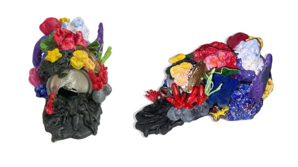
Yanyu Li
Grade: 11 Course: Art 3 Title: Trash Vortex Medium: Sculpture Instructor: Brooke Doan Artist Statement Eight million tons of plastic and other substances enter the ocean each year. From the moment the plastic enters the ocean, it begins a long and destructive journey. And the plastic and other garbage that enters the ocean can be carried far away infiltrating ecosystems and causing incalculable damage to marine life. My idea generation came from an article that I read about the Great Pacific Garbage Patch and it’s basically a gyre of marine debris particles in the North Pacific Ocean. On my thumbnail I designed a theme called Trash Vortex, and I used a variety of marine life to present my project, such as the sea turtle, octopus, jellyfish, polar bear, melting iceberg, seaweed biological etc. The main body will be settled on a can and the can collaborated with clay that was shaped with different kinds of marine creature. At the bottleneck is an extension piece that is colored in black which represents the chemical pollution that floats into the ecosystems. |
|
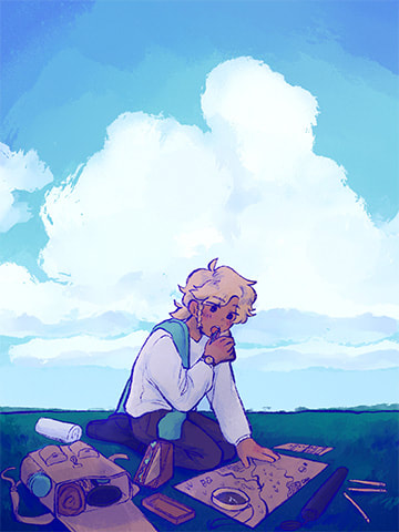
Danielle Minn
Grade: 11 Course: Art 4 Title: Lunch Break Medium: Digital Instructor: Brooke Doan Artist Statement I love to look at art pieces where a story is told without words, whispers of lives in every line, every detail, every brush stroke. Every piece of the artwork comes together to create a coherent story. In my concentration, I follow the life of a character as he explores and interacts with the world around him; a series of snapshots that captures the every days of life. In this particular piece, I wanted to show a moment of rest between times of travel. Taking a breather every once in a while to slow down and prepare for the adventures ahead is a vital, yet often overlooked, step in the journey of life, no matter the setting. I also love to explore a range of different lighting and coloring, and how different combinations can have different effects on the overall mood. Blue can represent peace, tranquility, and wisdom, but more importantly, it is simply calming to look at. I want the audience to look at a piece and immediately feel how the character feels, without analysis required. |
|
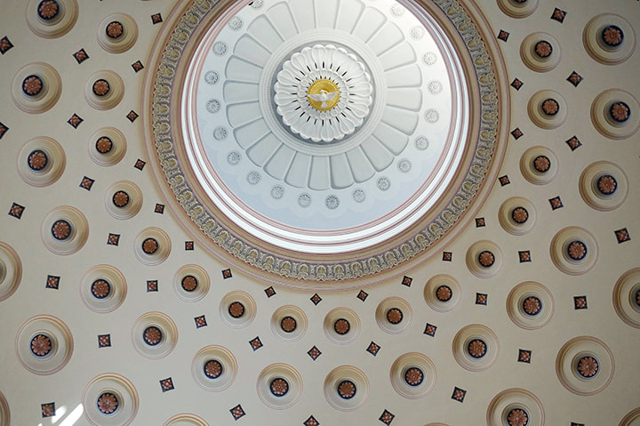
Soumika Pendem
Grade: 12 Course: AP Photo III Title: Dome Medium: Digital Photography Instructor: Caroline Creeden Artist Statement My photographs tend to follow the often overlooked aspects of architectural design or show a contrast between a design element and the surroundings. For example, my work commonly exhibits a juxtaposition between contemporary architecture over neoclassical, gothic, and other architecture styles from more than a century ago. I also frequently show the nature surrounding a structure as the unplanned surroundings can affect how the structure is perceived, even if unintended by the artist. This photograph exhibits the dome of the first cathedral built in the United States, the Baltimore Basilica. I tried to capture the repeated circular shapes that lead your eyes through the photograph and outward as the rectangular frame crops the work. The light coming from the inner oculus is intended to give a feeling of warmth and serenity as the warmer tones contrasting the sunlight reflecting the cool white in the center. |

|
Erin Poynot
Grade: 12 Course: Art 4 Title: Insomnia Medium: Watercolor Instructor: Brooke Doan Artist Statement Fear. It's a feeling we all stray away from, a feeling we avoid. It's a feeling that makes us uncomfortable and uneasy. Yet, I find it fascinating; it's the way our minds react to things we don't understand. My paintings are a way for me to wrap my head around the world of fear, to make it make sense. The composition I chose is Insomnia, a painting depicting the fear symptom of losing sleep over the unknown. Through the watery arrays of colors, I'm able to create texture and layers, giving my painting an eerie depth. My color choice often consists of purples and greens, purple being the common color associated with fear, and green being associated with disgust. These colors convey the emotions I want my audience to feel when seeing my paintings, that gut wrenching feeling almost making them uncomfortable looking at my work. Yet, it also makes them not want to look away. |
|
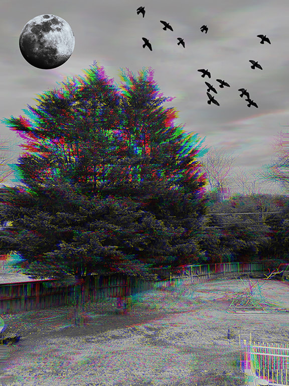
Brenna Siperko
Grade: 12 Course: Photo 3 AP Title: On the Otherside Medium: Digital Manipulation Instructor: Caroline Creeden Artist Statement I have been working on creating mythical, fantasy, and scary pieces of work in my sustained investigations. This image to me represents what a parallel dimension would look like. The colors compared to the black and white makes the image look like it is moving, while having the oddly big moon in the sky with a large flock of black birds. The picture has a sort of grim, nostalgic feeling that I usually get when I have seen some place in my dreams or memories. |
|
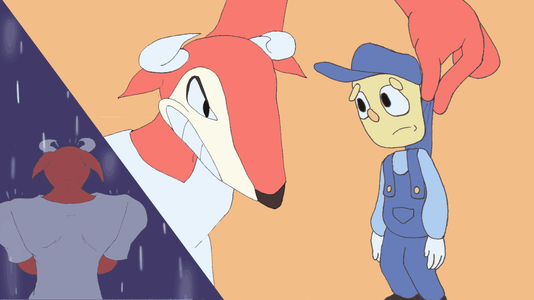
Bryan Tam
Grade:12 Course: Art 4 Title: Bull Bully Medium: Digital Animation Instructor: Brooke Doan Artist Statement As a kid, I always loved animation and the different art styles and approaches people have taken to make them. One of my favorite kinds of animation is the 1930's rubber hose style, and I reflected that in a lot of my portfolio pieces like this one! Like this hand drawn animation piece that was done on paper, I try to use the art style to convey a message or story, similar to how cartoons in general convey their own messages in TV show episodes. This one in particular is about a "Bull Bully" taking their aggression on a smaller character, but also shows the character's backstory which causes this behavior. |

|
Samantha Williams
Grade: 12 Course: Art 4 Title: Election Week Instructor: Brooke Doan Artist Statement My work explores the complex realities of modern suburban life in America, ranging from interpersonal relationships to sustainability to politics. Though these topics originate from my own life, they are representative of a broad collective experience. I have drawn heavy inspiration from Impressionist and Post-Impressionist masters, such as Seurat and Gauguin, to develop the subjects and techniques in my work. Thus, I combine a dated, historical style with contemporary imagery. This accomplishes a juxtaposition of eras, emphasizing the other juxtapositions present within my artwork: between humankind and nature, between memory and present reality, and here, in "Election Week," between red and blue political affiliations. |
