Atholton High School

|
Chiara Sforza
Grade: 11 Course: Photography 2 Honors Title: Water Bender Medium: Digital Image Instructor: Scott Brenfleck ARTIST STATEMENT The theme of this photograph is light. I drew my inspiration from the works of light painters. When creating this photograph, After thinking about and going through all of my possible light options I decided on my blue fiber optic light. Since it contained many different lights that would easily move, I could create more complex effects. This hunch was right, and I was able to create light spheres. I then decided that I would try a new approach, so I photographed myself standing and waved the light from side to side upwards, and then back down. This created the final image. I really enjoy that the light streak starts and ends in the same location. I thought that by doing this, the shape of the light would keep viewers' eyes drawn into the photograph. I imagined that their eyes, as mine did, would follow the flow of the streak, and their eyes would continue to follow the streak again and again, continuing to engage with the image. |

|
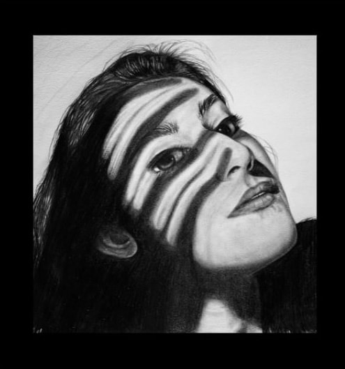
Beza Solomon
Grade: 11 Course: Art 4 Title: Projection Medium: Chalk and Digital Instructor: David Decker Artist Statement This year I have chosen to focus my art around a single medium. Using chalk pastels, I created Projection, a distorted portrait paired with a high contrast. This piece was mostly a challenge to myself to create a piece in which the features of the subject and perspective of the room were irregular, a change from the pieces I had previously created this year. This variation was an enjoyable diversion from my usual work. Diverting even more, I chose to incorporate a digital feature into this piece. The pattern on the face and limbs were created digitally and I feel that they add some needed interest to the foreground of the piece. Adding the pattern digitally allowed me to maintain an intentional line weight and let the pattern stand out as a smooth texture against the relatively rough lines of the chalk pastel. I find myself drawn to things that are out of the ordinary in some way, be it visually or conceptually, so creating an art piece with a visual twist felt like an accomplishment and allowed me to achieve the effect that I wanted to compose. |

|
Maggie Tyson
Grade: 11 Course: Art III: Portfolio Dev-AP Title: Weary Mind Medium: Lino Print Instructor: Mr. Decker Artist Statement I have been working in print-making this year in order to to take more time to think about my art as I’m producing it. The process requires carving linoleum tile, inking, and hand pressing the tile to transfer a print onto paper. “Weary Mind,” is a print variation I created by layering two separate prints over each other. The feeling that inspired this print was the mental fatigue, or, weariness, that grows from leading such a monotonous life in the time of Covid-19. I aimed to express that feeling in this piece primarily through the repetition of lines in the background, the pose of the subject, and her shadow. Her pose is meant to be one of exhaustion, as she is depicted with her head in her arms and curled in on herself. The lines and shadows in the background establish direction and movement. In tandem, all of these elements establish a weight that surrounds the subject, which further signifies that she is trying to isolate herself from the movement around her. Printmaking is a very time-consuming process, but it’s one that allows me to really think about what I am doing and what I am hoping to convey through my art. I hope that “Weary Mind” is relatable to all viewers in some way, as it is intended to capture the many emotions that have taken a toll on us in the last year. |
|
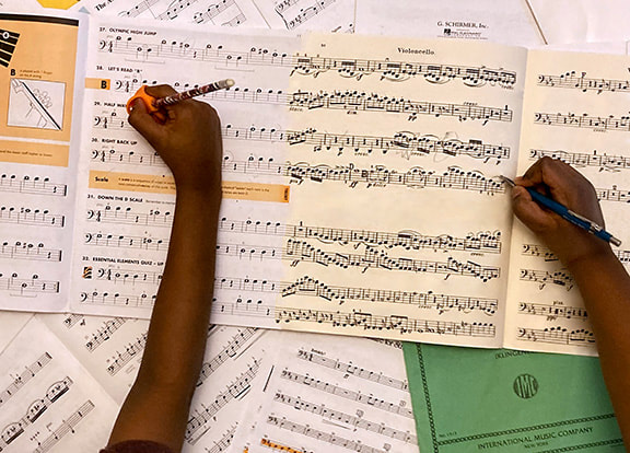
Maya Classon
Grade: 12 Course: Photography III AP Title: Ages Through the Pages Medium: Digital Photography Instructor: Scott Brenfleck Artist Statement A theme I am currently exploring is music; more specifically, what is our relationship with it, and how do we compose and consume it? I had my own answers to this question when I started, but each assignment I conducted explored a unique approach and helped me shape future assignments. With Ages Through the Pages, I initially wanted to reflect my personal experience growing up with music. Like many of my friends, I have been playing my instrument (the cello) and attending weekly lessons for most of my life. Looking at my collection of sheet music from past years brings back memories of performing on stage, preparing for auditions, and having fun in orchestra class. It also reminds me of how much I have improved as a musician. Putting some of my earliest exercises next to the more advanced pieces I now play looks almost ridiculous. This idea of juxtaposing beginner and advanced sheet music was my inspiration. I hope to represent the process through which one grows up with music and develops his or her musical ability. |

|
Riya Dalsania
Grade: 12 Course: Art 4 AP Title: Distance Medium: Acrylic Instructor: David Decker Artist Statement As an artist, I am using art as a platform to spread awareness for mental health. "Distance" was inspired by a time in my life when my anxiety took over my life. The central idea of my concentration demonstrates my anxiety. This concentration displays the pain and the thoughts that took over me. I hid my anxiety from others and the harsh reality. During my battles with anxiety, I felt like there was this dark shadowing following. That shadow brought this darkness in my mind: disapproval, loneliness, self-hatred. In this self-portrait, I used scraping techniques and paint dripping through the painting to capture a feeling of fading away. I focused on value and texture to emphasize the emotion on my face. My goal with my artwork is for people to understand the story behind the painting and connect their personal feelings with it. I want to show the unspoken truth of anxiety. |
|
Nikki Farnham
Grade: 12 Course: Art IV AP: Title: Filtered Light Medium: Graphite on Paper Instructor: Mr. David Decker Artist Statement The human experience is a beautiful thing, and art serves as the most expressive route through which to represent it. I've always been awestruck by hand-drawn portraits in particular, those that somehow convey the human face perfectly, blemishes and all. I never understood how the use of a paintbrush or graphite pencil could emulate such realism, such emotion, built into the nuances of facial expressions and subject placement. Conveying realism and depth in the human face goes beyond the meticulous techniques used to portray form. In every self-portrait I create, I attempt to illuminate an emotion or thought process, an underlying reason why I've tilted my head at a certain angle or hidden my face in the shadows. A head-on perspective allows full comprehension of the human face. But an angled perspective? Only allowing the viewer a glimpse at the right side of a face? Now there's a sense of mystery in the piece, challenging that sense of certainty we humans find necessary. I centered this self-portrait of mine, titled Filtered Light, on the contrast and value amplified by harsh lighting and the shadow of my hand. I've tilted my head to contribute to the air of mystery that elevates a piece and keeps the viewer interested. The slight part in my lips adds to the perception that I'm considering a secret nugget of knowledge, something that perhaps gives me confidence or is meant to be kept secret. As the focal point and most significant part of this piece, the shadow cast across my face creates strips of shadow that follow every ridge and curve in my facial structure. Light has effectively been filtered through my fingers, further contributing to the notion that not everything is being revealed. I've intentionally limited how m u c h o f m y f a c e i s o p e n l y p r e s e n t e d , s i g n i f y i n g t h e t i t l e o f F i l t e r e d L i g h t . |
|
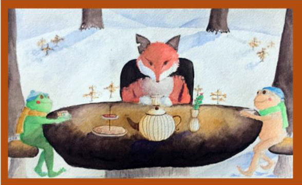
Sophia Leshchyshyn
Grade: 12 Course: Art 3 Title: Teatime Medium: watercolor Instructor: David Decker Artist Statement This painting was the last of a series of pieces showing the journey of two frogs who eventually encounter a fox. In this final painting, I wanted to relate the message, "Don't judge a book by its cover." The two frogs are very much alike and are drawn similarly with round features and coordinating colors. The fox, on the other hand, has sharper edges and looks more haggard. Of course, a fox is a natural predator of frogs, so the frogs have ample reason to fear the fox. But they give the fox a chance and find that he would just like some friends. Everyone deserves a chance, and this kind of open-mindedness can lead to a great friendship. My biggest inspirations for my work have been Christopher Maxwell and Linnea Sterte. Maxwell is best known for his whimsical watercolor paintings.. Linnea Sterte is well known for her frog prints. She has an excellent approach to drawing frogs in an anthropomorphic, comical manner. My favorite way to use art is for escapism. I'll often doodle what I wish I had, where I wish I was, or what I wish I could be.. While I don't begin with the intention of giving my artwork deep and philosophical meaning, I can often find such meaning afterward in what I created. My subconscious seems to push certain ideas into expression in my work. The idea of giving something an honest chance is something very important to me, and in this case, it ended up subconsciously influencing my piece. |

|
Madison McCabe
Grade: 12th Course: Photo 3 Honors Title: Bright Blooming Medium: Digital Photography Instructor: Scott Brenfleck Artist Statement For this year’s overall goal, we had to come up with a theme that relates to something in our life. I picked relationships because I have been in and out of different types of relationships my whole life. My friend and family relationships are very important to me, so I wanted to represent that in my photography. All of my assignments this year have been based around all different types of relationships and how they can affect our emotions and our lives. For this specific assignment, called “Bright Blooming” I chose to take a photograph of flowers and make the bud in the middle a bright color to make it the focal point. This photo is supposed to represent the new life that is being born into a family that already exists. When people have a newborn, everyone is focused on the new life that has come to earth. I wanted to highlight the image of the new bud by making it in bright colors and the rest of the photo in black and white. When you first look at my photo it looks like a nice arrangement of flowers, but it has a deeper meaning behind it. |

|
Katherine Morris
Grade: 12 Course: Photography III AP Title: Hint of Orange Medium: Digital Photography Instructor: Scott Brenfleck Artist Statement This semester I have been investigating the question, “How does the use of color within our environment impact us?” Seeing the world in color is something that has intrigued me since I first saw The Wizard of Oz. When Dorothy went from living in black and white in Kansas to Oz where everything was colorful and overly bright. When thinking about how to incorporate lots of color into my images, I thought of using colored light to achieve this goal. This led to me projecting different colors and patterns onto my subjects. In this case, orange and light blue squares. I have always been fascinated by portrait photography, particularly Annie Leibovitz. Her images are so striking that I am constantly thinking about them. For this specific image, I knew I wanted to create something with the same type of feel as Leibovitz’s. I believe the pose I chose adds to this feeling and makes the image seem much more artistic. Overall, I am so grateful for the past four years of art experience I have gained. I had never thought of myself as artistic or an artist before taking photography classes when I realized I had not been using the correct medium. Photography has become a huge aspect of my life and I am immensely thankful for the knowledge and skills I have gained from it. |

|
Anjali Pulim
Grade: 12 Course: Art IV AP Title: Rohan’s Room Medium: Digital Instructor: David Decker Artist Statement My work centers around capturing moments of comfort . I am inspired by my friends, family, surroundings, and nostalgia filled memories. While I have spent a lot of time reminiscing about the past four years, I’ve also been forced to think about and plan for the future. A future where I’m far from my friends and family and far from the comfort that I’m used to. A future where my friends and I will all be off on our own, making our own decisions, decorating our own rooms. I’ve always been enamored by how light is used to change the meaning and tone of an illustration telling a story. Just through the usage of light, the mood of a piece could be switched from happy and content to somber and melancholy. The artist Pascal Campion is someone who I believe has mastered the use of light in illustrative story-telling as his use of light is just as deliberate as his depiction of characters in a piece. With our time in high school coming to an end I’ve spent a lot of time talking to my friends and trying to enjoy every bit of our last full year together, and with this I’ve given a lot of thought as to how my friends’ personalities would evolve as we grew, thus inspired a series of drawings of my friends “dream” rooms, with Rohan’s Room being the strongest of the pieces I made. My art has helped me appreciate all the little things and people in my life, keeping me connected to those I care about in the present for all the years to come. |
